
Some are web app development specialists and some are the ones who just love to create and recreate. Things have changed rapidly in the last one decade and so has the way people think and understand things. Yes, specialists do have an experience of how to do things quickly and efficiently. But there are times when you need to step back and think about the bigger picture. It is not just about being competent but to develop utility that makes tasks simpler for daily living.
Mobile design has taken a crucial turn with the app development in the world of smartphones. The tricks of responsiveness and user interface are what appeals to people before they buy a new phone. Under are a few mobile app design tips that will help you set some predefined rules for yourself before you begin the overload of coding.
Grid it all!
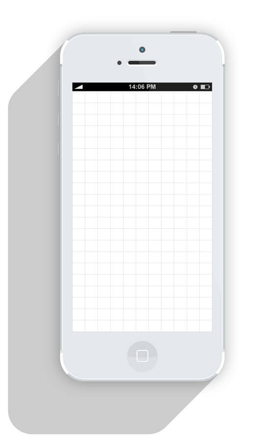
Okay, so to be honest it is very important to follow some basics and grids are the base of any mobile app design. Even if you keep it invisible, they will always be on the surface to guide you.
Element of Spacing
Any element on an empty space defines space. The moment you place a line, a shape or even a dot, you have clearly defined the margins. Instruments that create strokes can define the stroke you may have to work with.
Now as you know how your space is defined, to keep the consistency maintain widths and heights along with the margins and padding.
Make sure that every space that you create must be for a reason and should complement each other.
Colour is Crucial
Picking any random colour is not a good idea. Every colour has its own psychological and cultural relevance. So pick your colour wisely in order to add value to the purpose.
Talking of colours, let’s take it colour by colour. Let’s say you want to specify three points. The first point is denoted by crimson red, followed by a lighter colour of red and then the lightest hue. This means that the first point is the most important, button two is less and the next one is least. Just so you know hue is the base colour. If white is added to a colour, it is a tint of that colour if black is added, it is a shade of that colour. Get that?
Choosing the right colour defines customer relationship with a brand. Orange is the colour of optimism and Yellow is the colour of intellect. Using particular colours can also affect the moods of the end-user. Pairing call to action buttons with bright colours should be avoided; people often relate bright colours with non-usability.
Associate the colours with brand, not personal liking
Branding means developing a relationship with consumers emotionally about a product or service, so choose wisely, it may not be your choice but will bring effective results.
Logos just add some glamour, that’s all.
The brand and client relationship is much known to everyone. Using a logo isn’t going to elevate success stories for your business, but a bad logo will definitely be a bad identity for your business. Logos may never be timeless for the reason that design is quite trendy! So adapt to changes.
Elements need definition
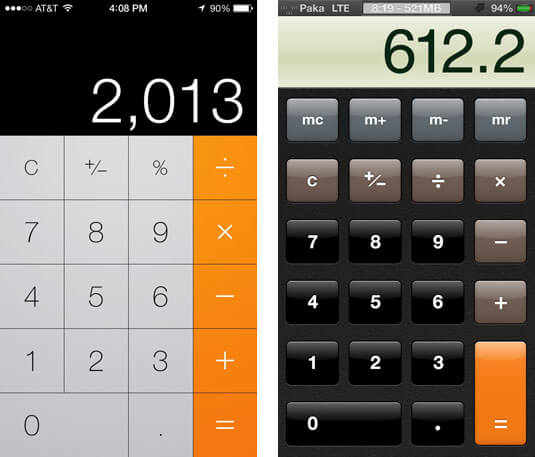
Never compromise on the visuals. Once you have a button of the color blue, keep in that way throughout. Consistency will make your designs a winner.
Just how you keep the color consistent, keeping the font equally balanced is necessary too. To add style to your content use all caps, title case, indent, contrast, and underline. Make ample use of these as long as you choose to maintain the consistency in text.
Be trendy, not foolish.
Study the trends. If you want to remain competitive, you will have to do what other are in a much better way to remain unique, for example making complete use of Minimalism and Flat Design.
Pick that Layout
Design layout libraries can be a tiring task in hand. However, you can find some here:
- pttrns.com
- mobile-patterns.com
- inspired-ui.com
- cocoacontrols.com
- lovelyui.com
- androidux.com
- Yahoo! Patterns Library
Know Hows’ of Fancy Fonts
Think before you choose, ask yourself:
- Can the font be used on mobile/web
- Is it legible?
- Are there enough variations?
A few points you should take into consideration:
- People cannot distinguish between Arial, Avenir, Roboto, or Helvetica.
- As long as your font makes sense, is clear and legible, you’re safe.
- Add complex elements when promoting a brand.
Well, that’s the set of tips we can help you with. But remember a few points are quite vital.
Let us know how you feel about it. You can also tell us if you have queries on anything particular while designing mobile/web apps.
Happy Designing!